Navigating Kubernetes View
This topic provides details about navigating the Kubernetes View. Kubernetes administrators benefit from advanced filter and map capabilities to quickly locate specific resources like clusters, nodes, namespaces, or workloads for both cloud-managed and self-managed clusters.
See Agentless Containers overview.
For general information on the Map, see Cloud Map Overview.
To see the Kubernetes View on the Map, navigate to Cloud > Explore > Map and click the Kubernetes button. For general Map navigation instructions, see Navigating the Map Infrastructure View.
 |
Exploring the Default View
By default, when you open the Kubernetes view, the Map displays all onboarded Kubernetes clusters from any cloud provider or self-managed clusters. Only the cloud-managed clusters are rendered under cloud account, and region. Self-managed clusters are rendered in a self-managed box, which means they do not have cloud-managed hierarchies such as accounts and regions.
If you have no filters selected in the Kubernetes View, you will see only clusters and traffic at the cluster level. This high-level default view provides context. To leave this default view and see traffic details and what is inside your clusters:
Drill down on a traffic line
Drill down on a cluster
Apply filters (recommended)
Filtering Your Map Resources
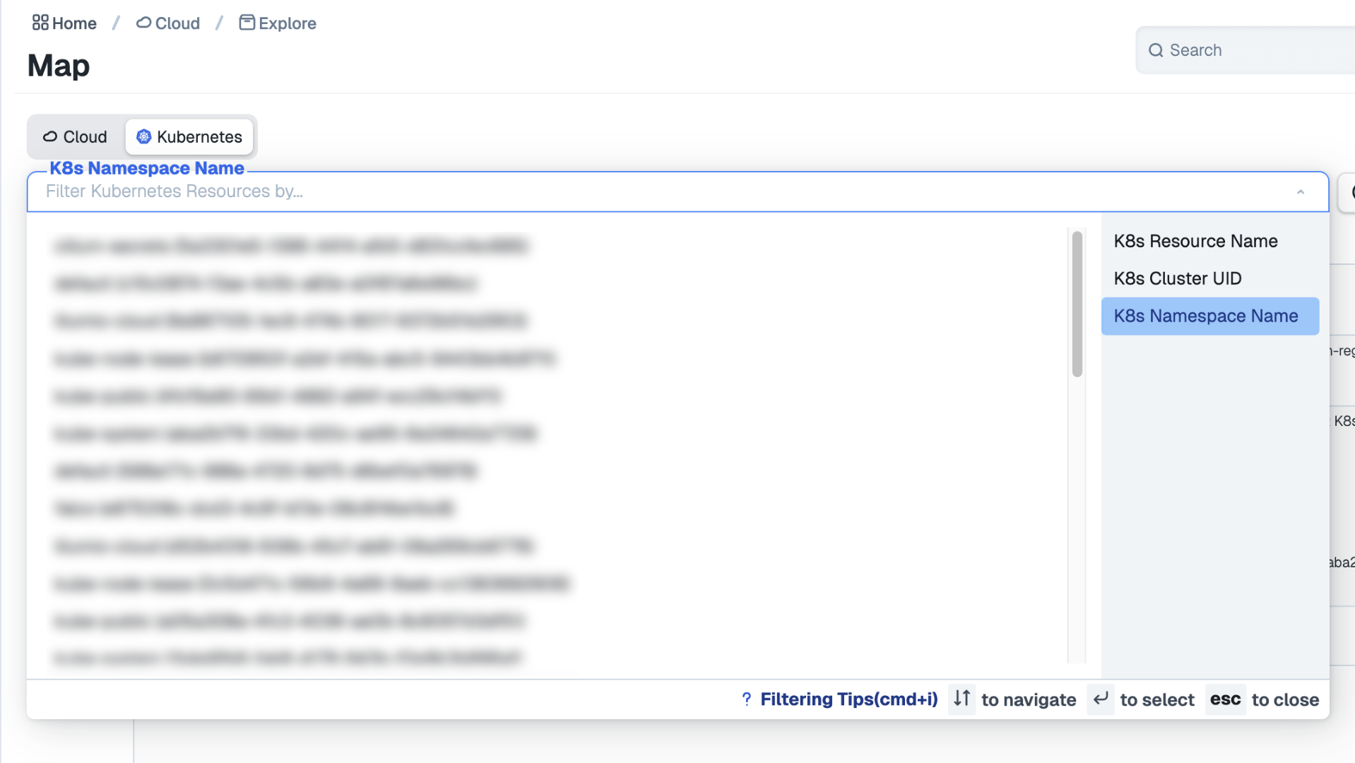
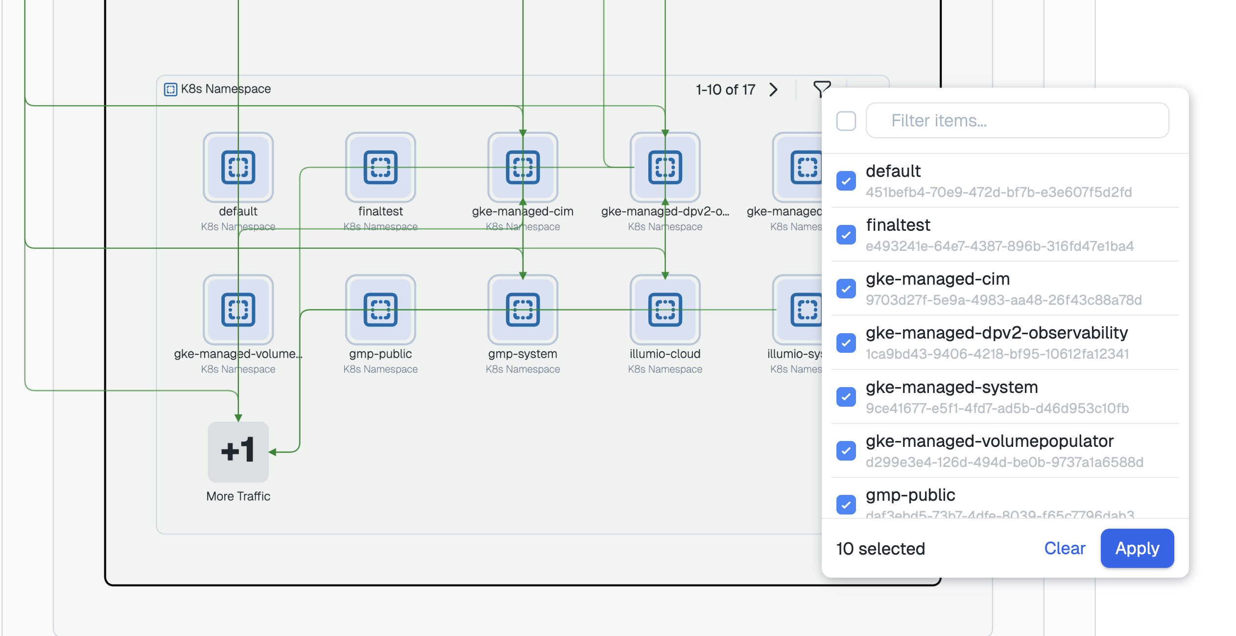
At the top of the page, the Map includes a Resource filter. The Resource filter includes several options, including Cloud, Account, Region, Resource Type, Cluster, Namespace, and others. Note that the Kubernetes View supports only resource-based filtering, so it is not refined by source or destination, for example. To make the filter appear, click the magnifying glass icon.
For example, you could filter by namespaces.
 |
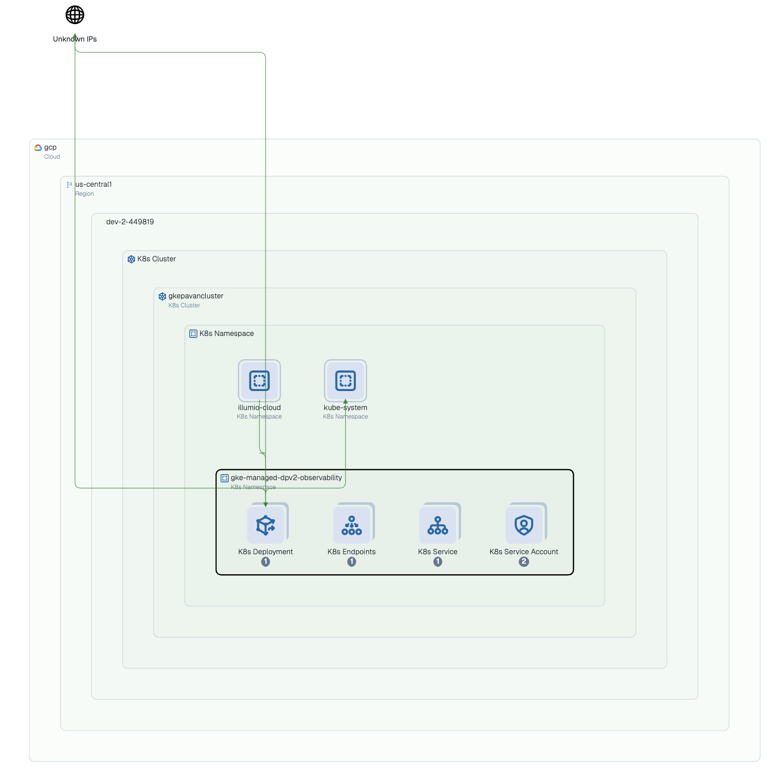
The Kubernetes map shows your Kubernetes resources as filtered by namespaces, displaying the contents and traffic inside the cluster.
 |
Examining resources
The Kubernetes view in Cloud Map displays k8s resources as icons, paginating them to display 10 at a time. These K8s resources include namespaces, clusters, nodes, custom resource definitions, and more.
The view displays traffic flows between resources as color-coded, directed links.
Understanding resource grouping
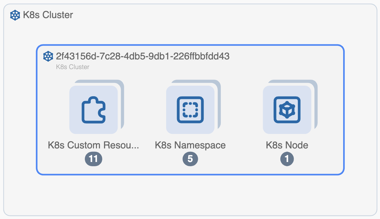
A square box with a kubernetes resource node in the new Kubernetes view represents either one K8s resource or a group of K8s resources of a single type. Groupings for a single type have a light blue background with a faint shadow. Single resources have a white background.
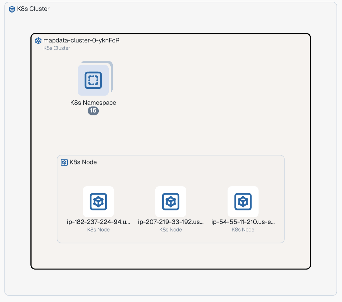 |
A kubernetes Cluster or namespace can contain groups of resources. Resources with the same type are grouped as "stacks" with numbers at the bottom.
 |
You can also filter within a group of resources of the same type by clicking the filter icon at the top right of the group and selecting the resources by name or ID.
 |
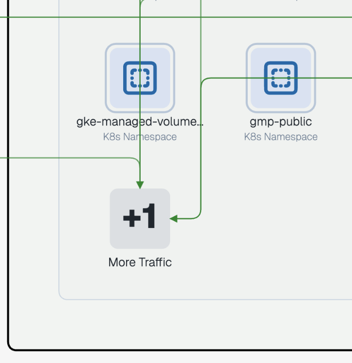
A large number and plus symbol, labeled More Traffic, indicates k8s resources hidden from view that are sending or receiving traffic. When you click this number, the paginated view expands to reveal them.
 |
Opening resource details
You can click any resource node to open a popup that displays basic metadata about the resource or resource group.
Each popup contains info and options specific to the resource's type. All k8s resources have detailed metadata you can view; click the Details button in the popup to open a side-panel containing the info.
Expanding and collapsing groups
When you click on or hover over a group, an icon appears in the top-right of the group's bounding box that you can click to either expand or collapse the view of the group.
Click
 show contained resources to expand a group and show resource node for the contained resources one-level down.
Click
 hide contained resources to collapse a group and show a resource node for the container group one-level up.
Click
 for a cluster to zoom in on it.
Display Resource Side Panel
When you click a Kubernetes cluster in the Map, it opens a right-side panel that displays the resource metadata. For example, you can click a Kubernetes cluster to see:
Summary information: Name, ID, Created, Type, Cloud, Region
Attached Resources: Custom Resource Definition, Daemon Set, Deployment, Endpoint, Namespace, and more.
Traffic: Traffic flow for the cluster.
Map Traffic Lines
The Map includes solid traffic lines for resources that are sending and/or receiving traffic. Flows that are one direction are displayed with a single arrow line. Bidirectional flows have dual arrows.
Orange lines indicate a mixed state (both denied and allowed) traffic. Green lines indicate allowed traffic, while red lines indicate denied traffic. These traffic lines are displayed from the lowest level node selected. For example, you may have green lines between two regions, indicating that strictly regional traffic is enabled. However, if you drill down, you might see a pair of resources, one in each region, with mixed state traffic between them.
When you hover over a traffic line, the map shows an animation of the traffic flow for just that traffic line. Similarly, when you hover over a resource displaying a traffic line, the map refreshes with an animation of the traffic flow for just that resource. This animation isolates the traffic flow for only the resource of interest. Using the hover effect is a good way to isolate a resource and see at a glance all the flows from that point of view coming from and going to that resource. To stop the animation, simply move your cursor to another part of the map.