Illumination Plus Map View
The Illumination Plus Map view visualizes workloads that form logical groups (based on labels attached to workloads) and provides an understanding of the traffic flows between workloads.
Grouping in the Map View
Groups in the Illumination Plus Map represent a collection of workloads or services that communicate with each other and for which you can write rules. Groups are displayed in the Map after you pair workloads. See the VEN Installation and Upgrade Guide for information about installing (also called pairing) VENs on workloads.
The Map displays three different types of groups: a group based on a single label, an app group, or a label set. A label set is a group of entities that have the same set of labels.
Once you pair VENs to create workloads, the PCE analyzes the workload data reported by the VENs. Based on the traffic flows among your workloads, the Illumination Plus Map organizes them into groups. A group could represent an instance of an application running in your data center, such as an HRM application running in the Test environment in your North America data center; or a group could represent a Web store in Production with its web workloads hosted in AWS and its databases hosted in your private data center.
The Illumination Plus Map lets you group by labels, locations, etc. It also lets you split the view when in Map view mode by selecting items on the Map.
Configurable Grouping
In Illumination Plus, grouping is implemented flexibly as you run your queries. Using the Group by menu, you can add different levels of grouping, such as grouping by types of labels and their order. You might want grouping by OS and then by environment. If you do not specify a particular grouping, Illumio will group workflows by the default, which is by workloads with the same set of labels. You can change your organization's default grouping using the same drop-down menu.
Note
For optimal scale and performance, if there are two connections with the same source workload, destination workload, destination port, and protocol but the process or service names are different, the two connections are combined in the Illumination Plus Map. The process or service name that was part of the most recently reported connection is displayed.
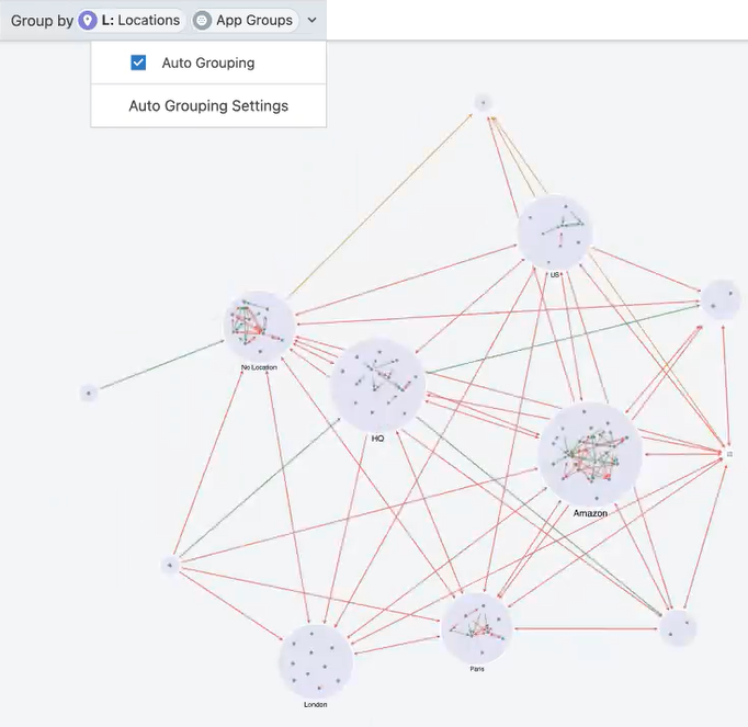
Selecting Auto Grouping from the Group by menu is a powerful feature in the Illumination Plus Map. Auto grouping gives you a level of grouping that cleanly displays your Map in a readable manner so that you only have the number of groups specified in your grouping threshold. You can disable Auto Grouping and force the Map to group by specific labels you select, for example, to group by the Business Unit and the App Group.
The Grouping threshold field in Auto Grouping Settings controls how grouping occurs. When you have more groups than the configured threshold, the Map groups to the next level.
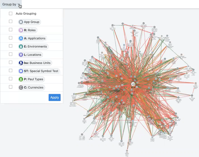
The following example demonstrates how auto grouping cleans up your Map.
Map without Auto Grouping enabled
Map view with Auto Grouping enabled
Tips for Grouping in Your Map
You can disable Auto Grouping and force the Map to group by specific labels you select, for example, to group by the Business Unit and the App Group.
Each group is a label set. Every workload that has the same set of labels will be grouped into one of those label-sets.
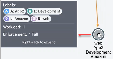
Hovering over a group in the Map displays a pop-up dialog box with the list of labels and number of workloads using the labels.
In the Group by drop-down list, you can drop and drag labels in the list to order how your Map displays the groups. Labels at the top of the list control the prominence of those groups in the Map.
The PCE web console displays the groups in your Map using the colors you've selected for your labels. Use these colors to help orient yourself on the Map.
Map Layout Options
You can choose how you the PCE web console to display your Map:
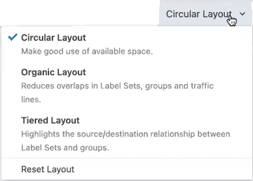
Not every layout choice is good for your Map data. See the descriptions of each layout in the drop-down menu.
For example, the Organic Layout option attempts to organize groups so that the workloads that are connected are grouped together and displays less cross traffic. Workloads that are communicating are grouped together on one side of the Map and the traffic links aren't crossing as much.
The Tiered Layout option provides a sense of traffic flow top to bottom. The Tiered Layout option is better for smaller data sets than larger ones.
How to read the Illumination Plus map
Legend
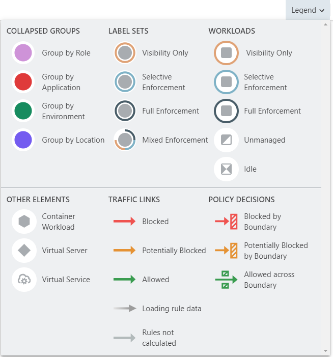
Pay attention to the way that the Map groups designate the enforcement mode for groups:
Workloads and groups inside full dark lines depict the FullEnforcement mode.
Workloads and groups inside light blue lines depict the SelectiveEnforcement mode.
Workloads and groups inside light orange lines depict the Visibility only mode.
The ring around a group denotes the proportions of different enforcement states
As you navigate into the groups, you notice that the workloads also have borders indicating their enforcement modes.
Traffic links are presented with lines and arrows in different colors:
Green: Traffic is allowed
Orange: Traffic is simulated blocked
Red: Traffic is blocked
Grey: Rules are not calculated
Gradient arrows: The light color is next to the source and dark next to the destination. Gradient arrows are used while the rule data is still loading from the traffic.
When you click a group in the Map, the PCE web console highlights the links to and from that group using the colors defined above.
Map Reported View
In the Map, the PCE web console displays the traffic using red, orange, or green lines to indicate whether the VEN had a rule that allows the traffic when the connection was attempted.
A green line indicates that the VEN had an explicit rule to allow the traffic when the connection was attempted
A red line indicates that the VEN did not have an explicit rule to allow the traffic when the connection was attempted
An orange line indicates that no explicit rule exists, but because of the enforcement state of the workloads, the traffic is not blocked when provisioned.
Note
When a policy change occurs, only flows that are created after the policy change are displayed in red or green based on the new policy. Flows created before the policy change might continue to be displayed in red or green using the old policy.
If multiple rules allow traffic between entities, only one green line is displayed.
Rules created for existing or live traffic don't change the color of the traffic lines in the Reported view, even when they are provisioned, until new traffic is detected.
Map Draft View
This view also displays the traffic using red, green, and orange lines to indicate whether the PCE has a rule to allow the connection that was reported by the VEN. This way, you can add rules and see their anticipated effect in real-time before the rules are implemented. In the Draft view of the Map, line colors have the following meanings:
A green line indicates that the PCE had an explicit rule (in either a draft or an active policy) to allow traffic when the connection was attempted.
A red line indicates that the PCE did not have an explicit rule (in either a draft or an active policy) to allow traffic when the connection was attempted.
An orange line indicates that no explicit rule exists, but because of the enforcement state of the workloads, the traffic will not be blocked when the rules are provisioned.
Panels in the Map View
When you click an object in the Illumination Plus Map, the PCE web console displays a side panel on the right that contains three tabs (depending on the object you clicked): Summary, Connections, and Workloads.
Summary Tab
The Summary tab in the Illumination Plus Map displays information about a selected object. To view the Summary tab, select an item, such as a traffic line, on the Illumination Plus Map. The Map has a few types of Summary tabs:
Traffic detail
Group detail
Workload/Virtual Service/Container Workload/Virtual Server
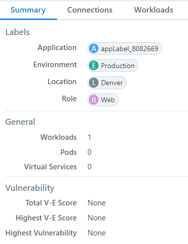
For example, when you click a group in the Map, the Summary tab displays what the labels are, how many workloads there are, how many virtual services, the enforcement level, and you get detailed links depending on how far you drilled into the group.
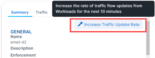
Increase VEN Traffic Update Rate
By default, VENs update traffic on the Illumination map every 10 minutes. You can temporarily increase the update frequency to once per minute. After 10 minutes, the default update rate of once every 10 minutes resumes. To use this feature, click a workload in the map to display the panel. In the Summary tab, click the option Increase Traffic Update Rate.
Connections Tab
The Connections tab is a summary version of the main Table view and filtered by what you've selected in the Map.
The Connections tab appears regardless of what you select in the Map: group types, workloads, IP lists, private addresses, public addresses, or links. By default, the Connections tab displays the following columns.
Policy Decisions (reported and draft)
Consumer Labels
Provider Labels
Provider Port Processes
You can add additional columns by selecting options from the Customize columns drop-down list:
Consumer Processes
Flows/Bytes
First Detected
Last detected
See Customize Columns for more information.
Workloads Tab
The Workloads tab displays a list of all workloads in the selected group and the following information for each workload:
Workload name
The V-E (vulnerability) score
Enforcement mode
Labels
As you drill in and out of the groups in the Map, the Workloads tab adjusts to show the workloads in the super set group.