Map View
Use the Map to visualize workloads that form logical groups (based on labels attached to workloads) and to better understand the traffic flows between workloads.
Grouping in the Map
Groups in the Map represent a collection of workloads or services that communicate with each other and for which you can write rules. Groups are displayed in the Map after you pair workloads. For information about installing (also called pairing) VENs on workloads, see the VEN Installation and Upgrade Guide.
The Map displays three different types of groups: a group based on a single label, an app group, or a common set of labels.
Once you pair VENs to create workloads, the PCE analyzes the workload data reported by the VENs. Based on the traffic flows among your workloads, the Map organizes them into groups. A group could represent an instance of an application running in your data center, such as an HRM application running in the Test environment in your North America data center, or a Web store in Production with its web workloads hosted in AWS and its databases hosted in your private data center.
The Map lets you group by labels, locations, app groups, etc. It also lets you split the view when in Map view mode by selecting items on the Map.
Configurable Grouping
The Group by menu allows you to specify different levels of grouping, such as grouping by types of labels and their order. You might want to group by OS and then by environment. If you do not specify a particular grouping, Illumio groups workflows that have the same set of labels. You can change your default grouping through the Group by menu.
Note
For optimal scale and performance, if there are two connections with the same source workload, destination workload, destination port, and protocol but the process or service names are different, the two connections are combined in the Map. The process or service name that was part of the most recently reported connection is displayed.
Tips for Grouping in Your Map
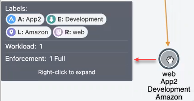
Each group is a label set. Every workload which has the same set of labels is grouped into one of those label-sets.
Mousing over a group in the Map displays a pop-up dialog box with the list of labels and the number of workloads using the labels.
In the Group by drop-down list, you can drag and drop labels in the list to re-order how the Map displays groups. Labels at the top of the list control the prominence of those groups in the Map.
The PCE UI displays the groups in your Map using the colors you've selected for your labels. Use these colors to help orient yourself on the Map.
Map Layout Options
You can choose how the PCE UI displays the Map:
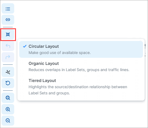
Not every layout choice is good for your Map data. See the descriptions of each layout in the Layout menu.
For example, the Organic Layout option attempts to organize groups so that the workloads that are connected are grouped together and displays less cross traffic. Workloads that are communicating are grouped together on one side of the Map and the traffic links aren't crossing as much.
The Tiered Layout option provides a sense of traffic flow from top to bottom. The Tiered Layout option is better for smaller data sets than larger ones.
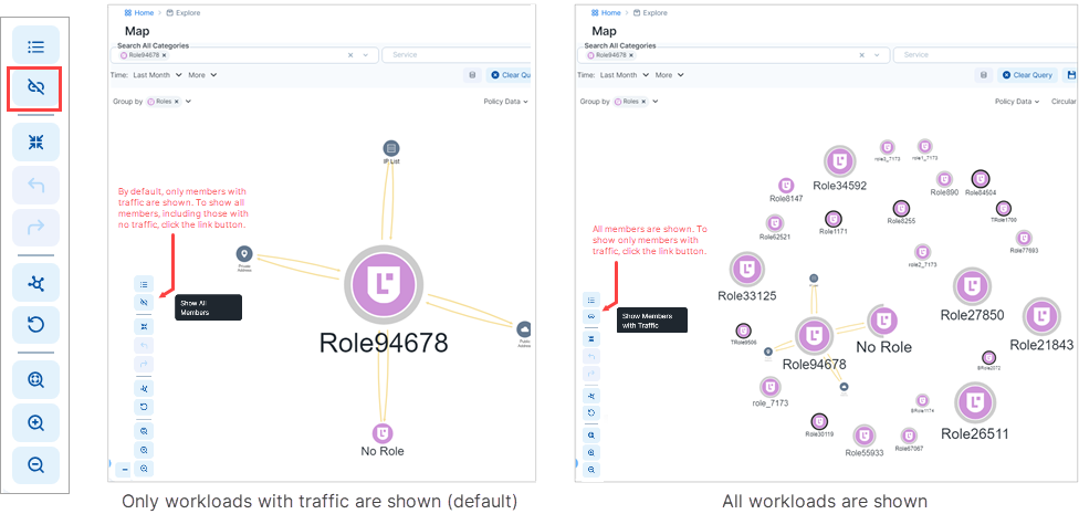
Show All Endpoints
In earlier Core releases, running a query in the Map revealed only endpoints that have traffic flows. Beginning in Core release 23.5, you can redraw the map to reveal all endpoints, including those with no traffic. Click the "link" button in the bottom left corner of the map.
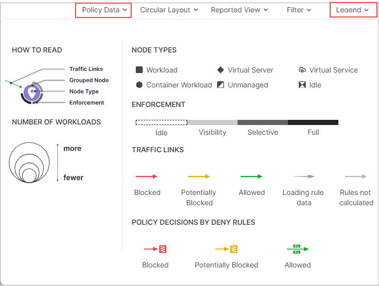
How to Read the Map Symbols
There are two legends for the side panel, one for Policy Data mode and another for Vulnerability Data mode. You can use the drop-down selector above the panel to switch between these modes.
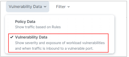
Legend - Policy Data
Legend - Vulnerability Data
For more about the Vulnerability Tab, see Vulnerabilities Tab.
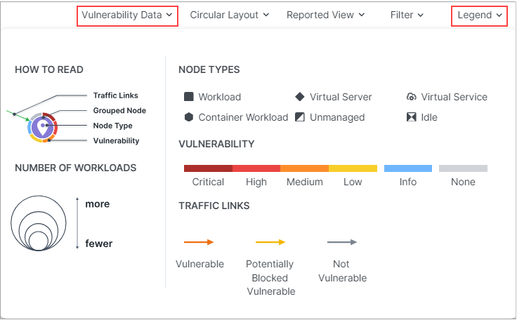
Map Symbols Explained
Number of Workloads (Policy Data and Vulnerability Data modes)
The relative size of each node indicates the number of workloads in the node.
Enforcement (Policy Data mode)
Pay attention to how the Map groups designate the enforcement mode for groups:
Workloads and groups inside fully dark lines are in FullEnforcement mode.
Workloads and groups inside semi-dark lines are in SelectiveEnforcement mode.
Workloads and groups inside light gray lines are in Visibility only mode.
Workloads and groups not surrounded by any of the above-described lines are in Idle mode.
The completeness of the ring around a group denotes the proportions of different enforcement states
As you navigate into the groups, you notice that the workloads also have borders indicating their enforcement modes.
Traffic Links (Policy Data mode)
Traffic links are presented with lines and arrows in different colors:
Red: Traffic is blocked
Yellow: Traffic is potentially blocked
Green: Traffic is allowed
Gradient arrows: The light color is next to the source and dark next to the destination. Gradient arrows are used while the rule data is still loading from the traffic.
Grey: Rules are not calculated
Traffic Links (Vulnerability Data mode)
Traffic links are presented with lines and arrows in different colors:
Red: Traffic is vulnerable
Yellow: Traffic is potentially blocked and vulnerable
Grey: Traffic isn't vulnerable
Vulnerability
When in Vulnerability Data mode, the color of each node's outer ring indicates the criticality of it's current vulnerability level.
Dark red: Critical
Red: High
Orange: Medium
Yellow: Low
Blue: Info
Light gray: None
When you click a group in the Map, the PCE UI highlights the links to and from that group using the colors defined above.
Map Reported View
The PCE UI displays the traffic on the Map using red, orange, or green lines to indicate whether the VEN had a rule that allows the traffic when the connection was attempted.
A green line indicates that the VEN had an explicit rule to allow the traffic when the connection was attempted
A red line indicates that the VEN did not have an explicit rule to allow the traffic when the connection was attempted
An orange line indicates that no explicit rule exists, but because of the enforcement state of the workloads the traffic is not blocked when provisioned.
Note
When a policy change occurs, only flows that are created after the policy change are displayed in red or green based on the new policy. Flows created before the policy change might continue to be displayed in red or green using the old policy.
If multiple rules allow traffic between entities, only one green line is displayed.
Rules created for existing or live traffic don't change the color of the traffic lines in the Reported view, even when they are provisioned, until new traffic is detected.
Map Draft View
This view also displays the traffic using red, green, and orange lines to indicate whether the PCE has a rule to allow the connection that was reported by the VEN. This way, you can add rules and see their anticipated effect in real-time before the rules are implemented. In the Draft view of the Map, line colors have the following meanings:
A green line indicates that the PCE had an explicit rule (in either a draft or an active policy) to allow traffic when the connection was attempted.
A red line indicates that the PCE did not have an explicit rule (in either a draft or an active policy) to allow traffic when the connection was attempted.
An orange line indicates that no explicit rule exists, but because of the enforcement state of the workloads, the traffic will not be blocked when the rules are provisioned.
Filtering the Map
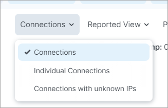
Connections Menu
When viewing the Traffic tab in on the Connections Menu allow you to view aggregated or individual connections.
Filter drop-down
Options in the Filter drop-down allow you to control which traffic information is displayed on the Map. This is useful for controlling the overall complexity of the visual information, making it easier to focus on the types of traffic you're interested in at any given time.
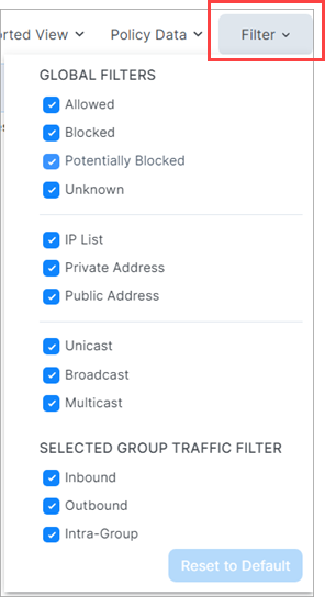
The Filter dropdown presents two types of filters:
Global Filters
These filters allows you to control the display of traffic for everything on the Map, whether selected or not.
Selected Group Filters
These filters allow you control the display of traffic only for the selected group on the Map.
Panels in the Map
Tip
Use the drop-down selector above the panel to switch between the Policy Data and Vulnerability Data modes.
When you click an object in the Map, a side panel opens on the right that contains a number of tabs.
Summary Tab
The Summary tab displays information about the selected object. To view the Summary tab, click an item on the Map. The information displayed depends on the type of object you clicked and how deeply you've drilled into the object. For example, when you click a group in the Map, the Summary tab displays the labels in use, the number of workloads and virtual services, and the enforcement level. In general, the deeper you drill into an object, the more detailed information that is displayed in the side panel.
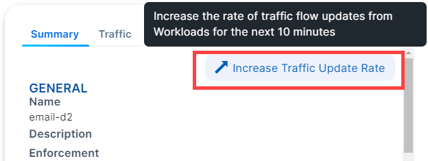
Increase VEN Traffic Update Rate
By default, VENs update traffic on the Illumination map every 10 minutes. You can temporarily increase the update frequency to once per minute. After 10 minutes, the default update rate of once every 10 minutes resumes. To use this feature, click a workload in the map to display the panel. In the Summary tab, click the option Increase Traffic Update Rate.
Traffic Tab
The Traffic tab is a summary version of the main Traffic table and filtered by what you've selected in the Map. The Traffic tab appears regardless of what you select in the Map: group types, workloads, IP lists, private addresses, public addresses, or links. By default, the Traffic tab displays the following columns.
Policy Decisions (reported and draft)
Source Labels
Destination Labels
Destination Port Processes
You can add additional columns by selecting options from the Customize columns drop-down list:
Source Port/Process User
First Detected
Flows/Bytes
Last detected
See Customize Columns for more information.
Workloads Tab
The Workloads tab displays a list of all workloads in the selected group and the following information for each workload:
Connectivity
V-E (vulnerability) score
Enforcement
Visibility
Name
Policy Sync status
Ransomeware Exposure
Protection Coverage Score
Labels
When the policy was last applied
As you drill in and out of the groups in the Map, the Workloads tab adjusts to show the workloads in the super set group.
Virtual Services Tab
The Virtual Services tab displays a list of all Virtual Services in the selected group. A drop-down selector allows you to filter the list by Virtual Services with Traffic or All Group Virtual Services. The list provides following information for each virtual service:
Name
Provision Status
Service/Ports
Addresses
Labels
Workloads / Container Workloads
Description
You can add or remove columns by using the Customize columns drop-down list. See Customize Columns for more information.
Vulnerabilities Tab
Tip
Use the drop-down selector above the panel to switch between the Policy Data and Vulnerability Data modes.
The Vulnerabilities Tab appears in the right panel when you're in Vulnerability Data mode (see note above). It details risk due to vulnerabilities. The workload with the most vulnerabilities appears at the top of the list. You can sort the V-E score column by vulnerability score. You can then define your patch priority based on the most critical score.
You can see the highest severity type for the workload and the total number of vulnerabilities associated with the workload. The port and protocol is mapped to a vulnerability (if it exists). Under the Vulnerabilities tab, all the vulnerabilities for the workload are sorted in order of severity. You can see the following information for each vulnerability:
Total V-E score of the workload
Vulnerability score of the most severe network-accessible vulnerability on the workload
East-West exposure
Northern Exposure (Internet exposure)
Number of workloads exposed to this vulnerability
Associated port and protocol
CVE-IDs (a unique identifier for the vulnerability)
Name of the vulnerability
The East-West Exposure Score is recalculated whenever the rules associated with the workload are changed.
For more details about the Vulnerability Map and how to work with it, see About Vulnerability Map.